Example 1:
import matplotlib.pyplot as plt
fig = plt.figure()
ax = fig.add_axes([0,0,1,1])
langs = ['C', 'C++', 'Java', 'Python', 'PHP']
students = [23,17,35,29,12]
ax.bar(langs,students)
plt.show()
Example 2:
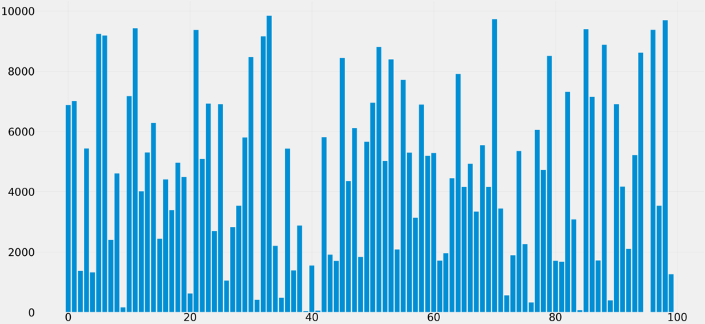
import matplotlib.pyplot as plt
import numpy as np

plt.style.use('fivethirtyeight')
plt.figure(figsize=(80, 80)) # enlarge the figure
plt.rc('xtick', labelsize=80)
plt.rc('ytick', labelsize=80)
data = [6873, 7005, 1372, 5438, 1323, 9238, 9184, 2396, 4605, 162, 7170, 9421, 4012, 5302, 6277, 2438, 4409, 3391, 4956, 4488, 622, 9365, 5088, 6926, 2691, 6909, 1050, 2824, 3538, 5801, 8468, 411, 9158, 9841, 2201, 481, 5431, 1385, 2877, 36, 1547, 48, 5809, 1911, 1702, 8439, 4349, 6111, 1830, 5657, 6951, 8804, 5022, 8391, 2083, 7713, 5300, 3133, 6890, 5190, 5286, 1710, 1953, 4445, 7903, 4154, 4926, 3335, 5539, 4156, 9723, 3438, 556, 1885, 5349, 2258, 324, 6050, 4722, 8506, 1707, 1673, 7310, 3081, 65, 9393, 7147, 1717, 8878, 389, 6908, 4165, 2099, 5213, 8610, 3, 9368, 3536, 9690, 1259]
x = np.arange(len(data)) # x has to be different
plt.bar(x, data)
plt.show()