ASX Foundamental Analysis
ASX stock distributions
import pandas as pd
import matplotlib.pyplot as plt
df = pd.read_csv('asx.csv')
df.head()
plt.figure(figsize=(10, 10))
plt.xlabel('Stock number')
plt.ylabel('Industry group')
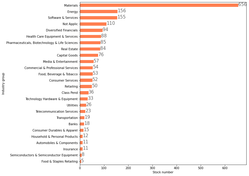
ax = df.industry_group.value_counts().plot(kind='barh', color='coral')
# create a list to collect the plt.patches data
totals = []
# find the values and append to list
for i in ax.patches:
totals.append(i.get_width())
# set individual bar lables using above list
total = sum(totals)
# set individual bar lables using above list
for i in ax.patches:
# get_width pulls left or right; get_y pushes up or down
ax.text(i.get_width()+.3, i.get_y()+.38, \
str(i.get_width()), fontsize=15, color='dimgrey')
# invert for largest on top
ax.invert_yaxis()